To create a brand that will entice clients in a very competitive market.
Delivered
Logo Design
Brand Identity
Advertisement copy and design
Result
Lots of phone calls and new customers following the print ad.
Goal
To create a brand that will entice clients in a very competitive market.
Delivered
Logo Design
Brand Identity
Advertisement copy and design
Result
Lots of phone calls and new customers following the print ad.
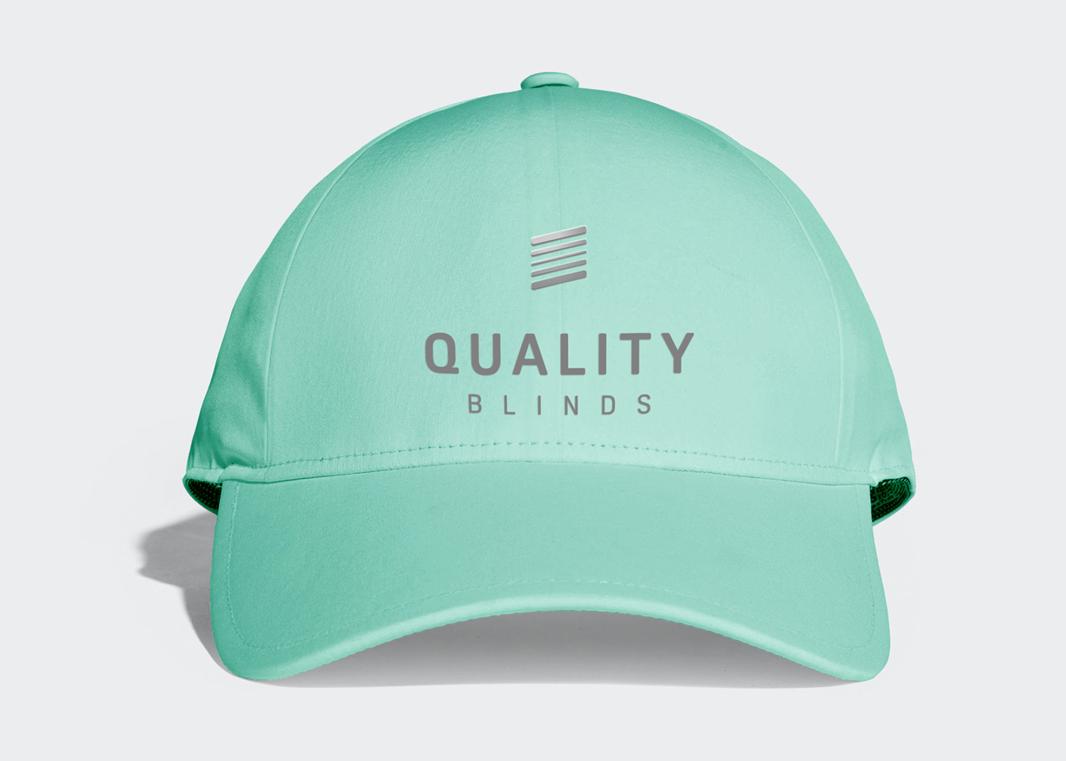
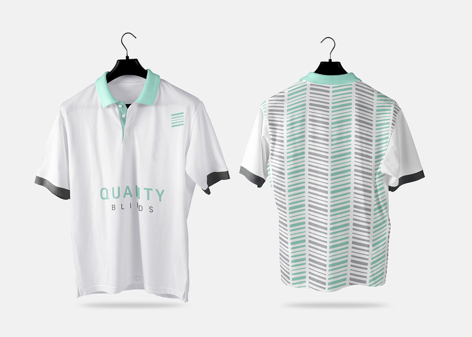
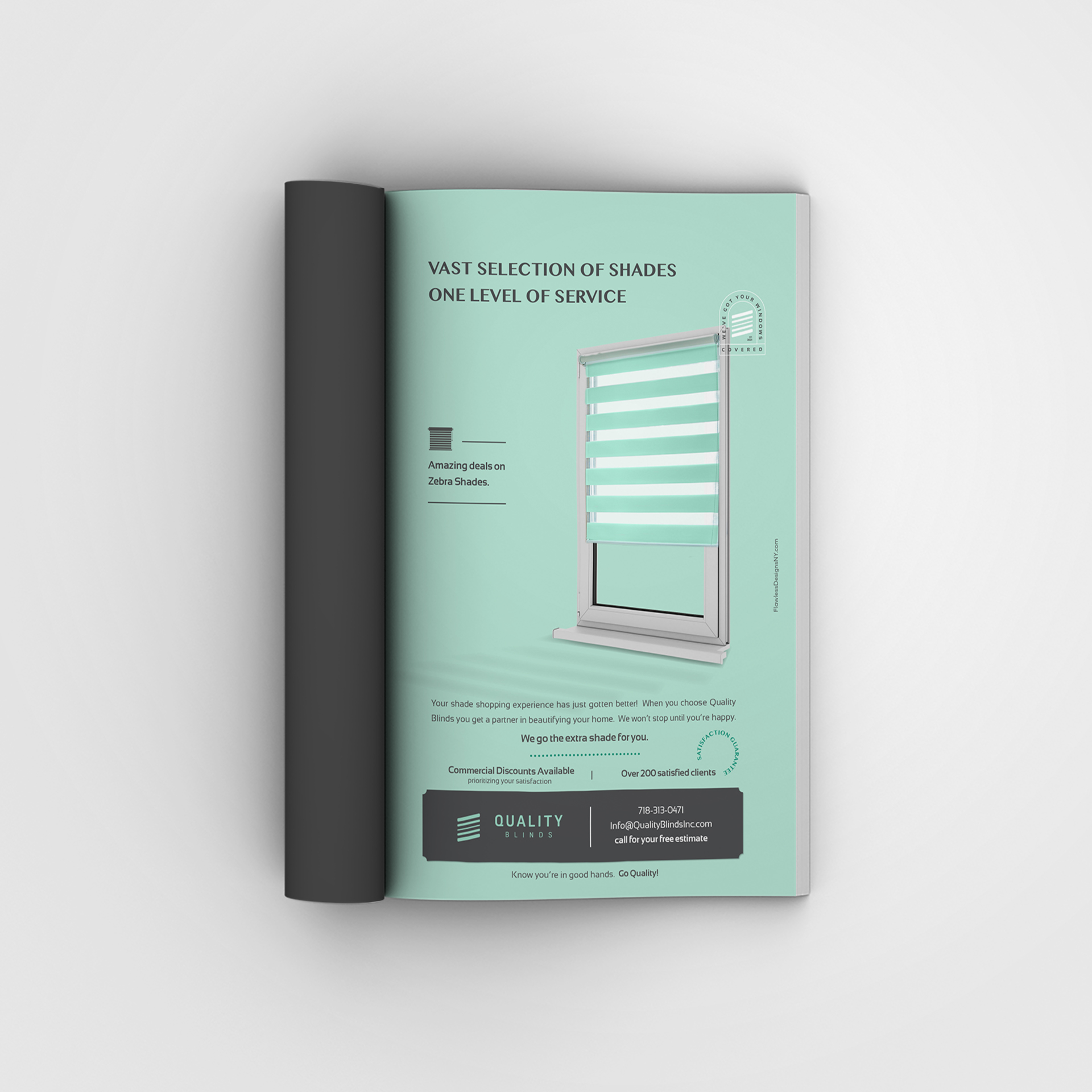
We went with a shade icon for instant recognition of what they do. The blinds are tilted upward to represent a current brand with top notch
quality and service. We went with a mint green for the base color to stand out from competitors in the same area with a
homey, warm color.
We went with a shade icon for instant recognition of what they do. The blinds are tilted upward to represent a current brand with top notch quality and service.
We went with a mint green for the base color to stand out from competitors in the same area with a homey, warm color.
We highlighted the benefits of working with this company before getting into details to focus on the experience and connect consumers to a brand and a promise.
We highlighted the benefits of working with this company before getting into details to focus on the experience and connect consumers to a brand and a promise.
"I hired Flawless Designs to give my business a boost. I was extremely satisfied with the results. When I made the first call I didn’t even know what I wanted, Malka clearly explained all my options and what would work best. Everything came out amazing from a to z. My branding package was just perfect and my print ad brought me lots of orders."